Alongside sunken lounges, low-slung furniture, and bold-patterned floor rugs, the ’70s appear to be a decade well worth revisiting. The emerging interior colour scheme of yellow and brown may seem questionable to some, but for those who lived with it the first time around, there can be a nostalgic longing.
A hallmark of chic 1970s interiors, it’s still a scheme that makes you feel good, says Melbourne designer Nickolas Gurtler. “Rich golden tones pair beautifully with browns, creams and tans,” he says. “It’s a rich, flexible and timeless scheme with endless colour combinations that change the feel of a space depending on their composition.”

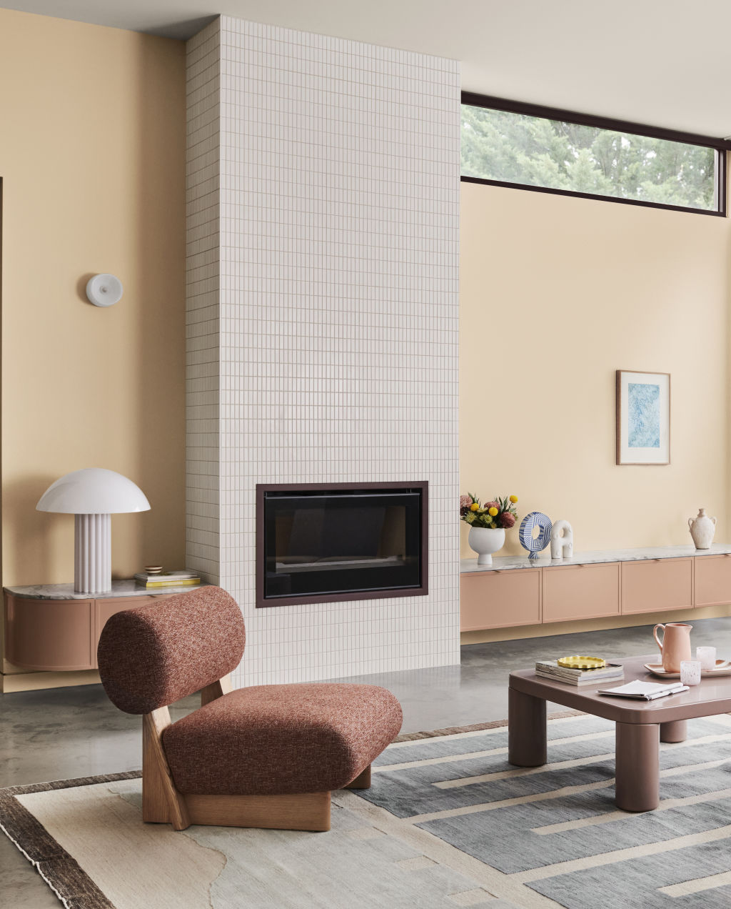
Many people may feel intimidated by the prospect of incorporating yellow and brown hues into their home, yet Dulux’s Andrea Lucena-Orr says it’s all in the mix. Dulux Summer Solstice palette Photo: Supplied
Andrea Lucena-Orr from Dulux agrees and says it’s the perfect palette for now. “With everyone feeling the pinch in their wallet, we are seeing more people at home, and colour is such an easy way to bring joy and positivity into a space, big or small,” she says.
Feather your nest with natural, golden hues for sumptuous radiance and a feeling of security and warmth using these expert tips for a new take on an old favourite.
Bringing the ’70s into now
“The earthy warm tones of the 1970s are back!” says designer Emma Blomfield, who believes their latest carnation is calmer and more welcoming than before. “Since the’70s, the application of these colours has varied, and with the adaption and development in production technology, our choices are greater with different textures, materials and colours such as terrazzo tiles, leather upholstery, heavily textured textiles and paints for an enveloping, cosy feel.”

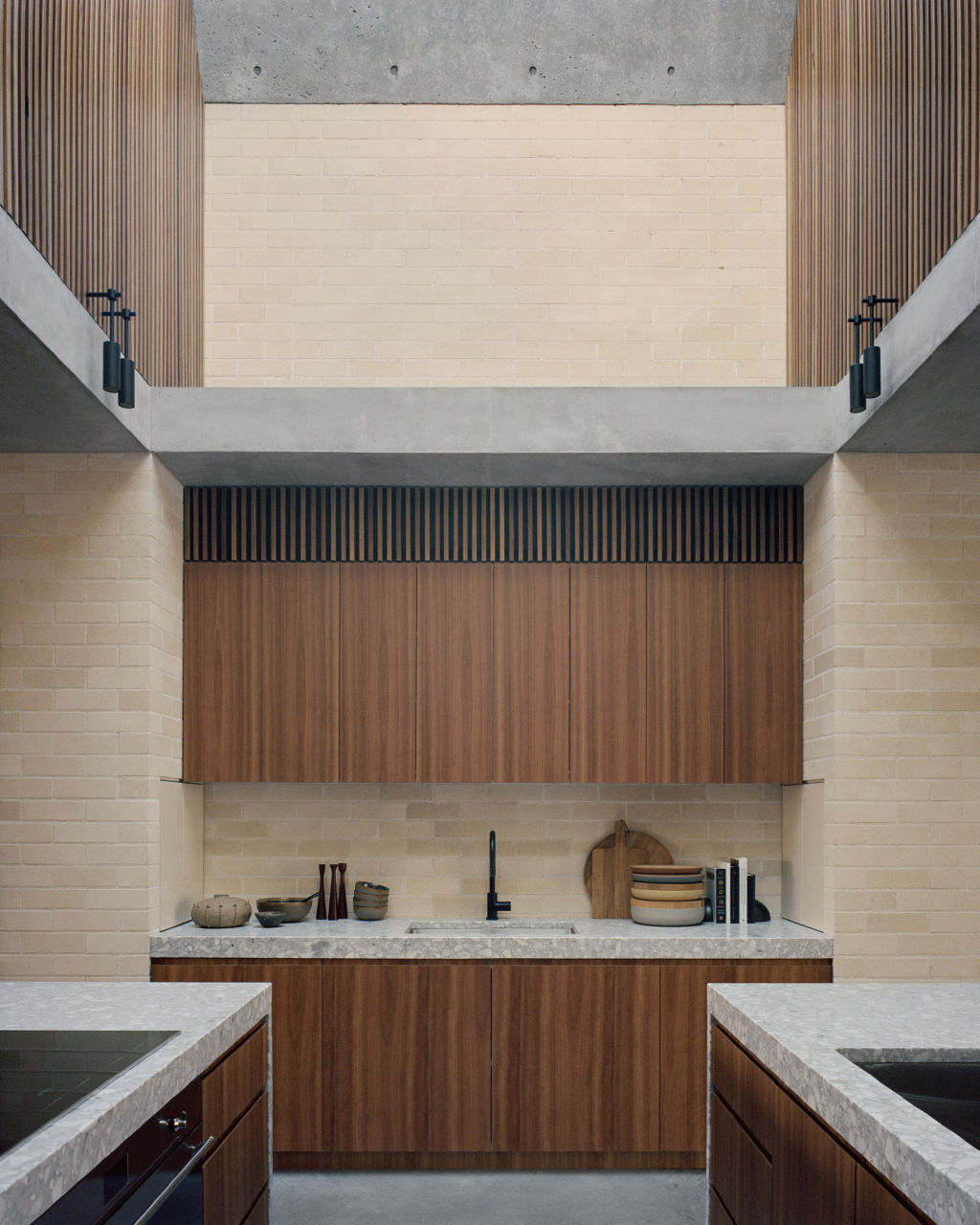
Tribe Studio Architects used sand-coloured clay bricks and Australian hardwoods to provide a yellow and brown palette in their Bronte House project. Photo: Rory Gardiner
Many people may feel intimidated by the prospect of incorporating yellow and brown hues into their home, yet Lucena-Orr says it’s all in the mix. “Fears tend to stem from past design periods where these colours were notoriously schemed together,” she says. “Today, we are seeing the shades and tones differently, and the way the colours are used together in styling and decor is much more sophisticated.”
For their Bronte House project, Tribe Studio Architects employed sand-coloured clay bricks and Australian hardwoods to provide its yellow and brown palette. “They are rich colours, and because they are integral to these raw materials, there is variety and natural pattern within the finishes,” says principal Hannah Tribe. “The warmth of the palettes is offset by the concrete floors and ceilings. I think the coolness of the concrete prevents the warm tones from becoming cloying.”
Paint and texture
Paint is often the simplest place to start when approaching a challenging palette. “Soft, warm yellows and browns can be incredibly immersive, so you can select a colour for your entire space and highlight specific architectural features, cabinetry or ceilings with a contrasting colour,” says Lucena-Orr.

Luna House by Nickolas Gurtler. Gurtler says textural interest is the secret to successfully applying the theme at home. Photo: Dion Robeson
The biggest mistake, she says, when experimenting with this scheme is not testing the colours in their new space before painting. “View them in your home’s natural lighting conditions to see whether they are compatible with your existing decor elements and furniture, fixtures and fittings and that they will work in your entire space, “she recommends.
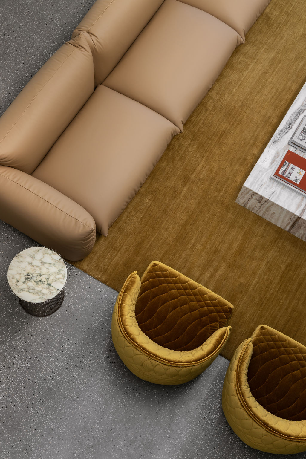
Gurtler says textural interest is the secret to successfully applying this theme. “A palette combining golden yellows, travertine, walnut, leather and wool harmonises when accented with aged brass and smoked glass,” he says. “Interiors can feel retro with a’70s flavour when expressed with vintage pieces, whereas it feels earthy and calming with rougher organic textures and gentle forms; it can even feel contemporary and chic when combined with sleek pieces in metal and glass.”

‘A palette combining golden yellows, travertine, walnut, leather and wool harmonises when accented with aged brass and smoked glass,’ Gurtler says. Elysium House by Nickolas Gurtler. Photo: Timothy Kaye
Texture is so crucial that Blomfield suggests including as much variety as possible. “Combine smooth and shiny with rough and textured for personality and vibrance rather than relying on colour to do this to the room,” she says, recommending materials such as boucle fabrics, 100 per cent wool tufted rugs, tan leather upholstery, terrazzo and Moroccan tiles.
If you are concerned about budget, look for upcycled furniture pieces or pre-loved gems. “You can even add small amounts of paint to liven up your space on items already in the home, such as cabinets, coffee tables or sculptural vessels,” says Lucena-Orr.
Article Source: Click Here
By Elizabeth Clarke
February 27,2024
